3 elements of mobile-friendly website design

Get free expert insights and tips to grow your knowledge business sent right to your inbox.
Statista reports that since the fourth quarter of 2019, mobile traffic makes up over 45% of all web traffic in the United States. It’s important that you provide a great experience no matter which device they use. This means your website needs mobile friendly design to support the digital home base of your knowledge commerce business.
'Mobile friendly' refers to the website’s overall ability to adapt to being visited on a mobile device rather than a desktop. It includes readability, typography, formatting, loading time, and more. One subset is mobile responsiveness which refers to the page layout responding to the size of the screen.
Your potential customers will visit your website on a variety of devices. In order to ensure your website supports your business, it’s imperative that it works well for the sizable percentage of traffic coming in on a mobile device.
Let’s dive into how to set up your website for success when being used on smartphones and tablets.
Elements of mobile friendly design
User experience and user interface design (and how they pertain to mobile devices) are both complex. Fortunately, experts in those fields have communicated steps that website owners can take for improved design. Here are three key design elements that any person with a website should focus on:
Usability
You’ve likely experienced the frustration of trying to use a desktop version of a website on a smartphone. This means zooming in to small text, scrolling sideways, and perhaps even pressing the wrong buttons. Doesn’t it redirect your attention away from the website content?
Being able to use a website as you need is key. Otherwise, the visitors will abandon the site.
Digital marketing expert Neil Patel cites data about some of the common problems that mobile web users recently encountered. The data showed 51% of the respondents experienced a website that crashed, froze, or had an error, and 48% visited a website where the formatting made it difficult to read.
Speed
Site speed is another critical aspect to supporting good mobile web experiences. Patel’s research also found 73% of respondents said they recently visited a site that was too slow to load on mobile.
But, speed is subjective. How slow is too slow? The data also shows that more than 81% of people will abandon a site that takes more than 5 seconds to load.
Some of the speed-related metrics are First Contentful Paint and Time to Interactive. Google defines FCP as “the time from when the page starts loading to when any part of the page's content is rendered on the screen.” TTI is when a page is fully interactive and ready for the web visitor to start using the page.
Want to test out a site? Check out the Google PageSpeed Insights tool.
Some of the recommendations to improve page speed are quite technical. Using a platform like Kajabi that has a team of engineers to handle the technology aspect is a great choice to ensure your site runs quickly. We stay on top of the latest tech developments so you can focus on the more profitable areas of running your business, like creating a new course.
Readability
Typeface and font choice play a big role in the readability of any written material. It has an especially big impact on retention of information learned from mobile devices because of the size of the screen compared to printed material, for example.
Typography is an art. But, you don’t have to be a graphic designer to implement some of the best practices that can support good overall and mobile friendly web design.
Experts recommend using sans serif fonts on mobile websites. These are fonts that do not have the embellishments at the end of the letter strokes. Sans serif fonts are often easier to read in smaller sizes than serif fonts, so they’re a good choice for the body content of any website.
Adobe recommends using no more than three font families in a design, and making sure the choices complement each other well. They also recommend using a font size of 16 or more for desktop, 11 or more for iOS devices, and 14 for Android devices.
Another important consideration is the spacing between lines, called leading. Text that is too close together can be hard to read, so having proper spacing can make it easier on the eyes.
How does mobile friendly design benefit the website owner?
Mobile friendly design clearly benefits website visitors, but how does it benefit you as the person operating a website?
Better mobile design correlates to better search engine optimization. The SEO benefits come from better website performance because users are having a better experience than they would if they were trying to navigate the desktop version of the site on their mobile device.
Formstack reports that 54% of users won’t recommend a website with a poor mobile design.
Visitors are more likely to spend more time on your site, navigate to more pages, and share your website if the design makes it conducive to doing so. These metrics are all part of how search engines rank results.
But does a mobile friendly site directly cause improved rankings on search engines? Kind of. Google shares that they index the content from mobile versions of sites and factor that into the ranking. So, if your mobile site version follows the recommendations and best practices, that can only help influence your ranking.
How Kajabi supports mobile friendly design
Kajabi's website themes are mobile responsive out of the box, making it a great experience no matter how your customer is coming to you. This also speeds up your time to getting a fully functioning website up and running. You don’t need to spend extra time optimizing for mobile or creating a second version of a site - it’s already generated for you.
If you host a membership community on Kajabi, that’s automatically mobile friendly too.
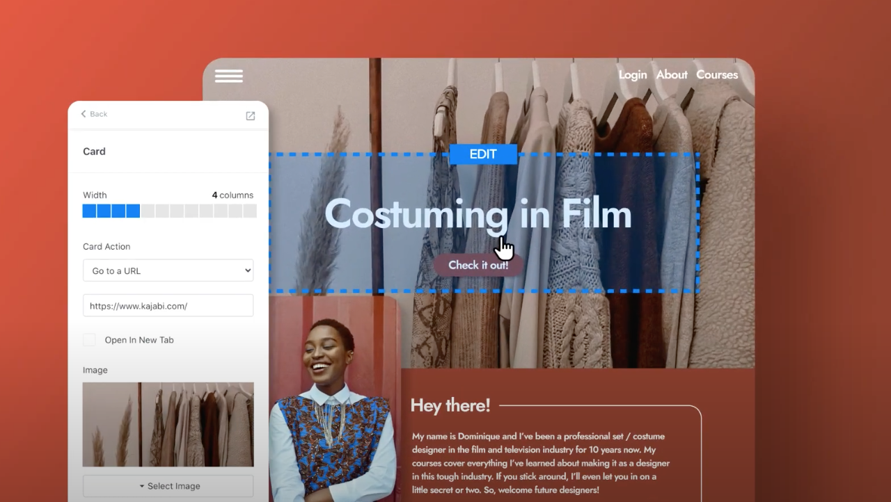
Kajabi’s website editor supports a mobile view so you can easily make sure your site looks great for mobile devices. It also helps you customize your Mobile Layout Settings.
But, even with our templates, Kajabi still provides the ability to make design tweaks for the mobile layout. You can have control over how your site looks and feels.
Kajabi knows that mobile friendly design is critical for our Heroes. We strike a balance between providing a mobile friendly version of the site for you and allowing you to customize as you see fit.
Getting started with Kajabi
Ready to build your mobile-friendly website and online business with Kajabi? Activate your free 14-day trial now!