

Table of Contents
Why every online community looks the same
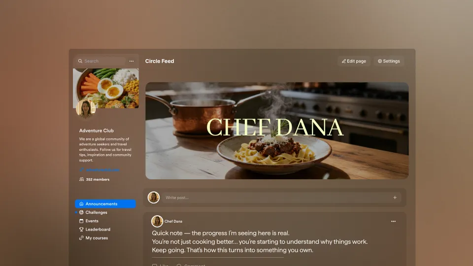
A recipe expert builds a 3,000-member community around their cookbook. The members pour in. They share photos of dishes they've made. They post variations. They ask questions about substitutions. And the platform serves it all back to them as a vertical wall of text-first posts, with author names and timestamps and threaded replies sitting where the food should be.
The community is built for the food. The interface treats it like another forum.
You've probably felt some version of this. You build a community for your work, your recipes, your training plans, your coaching, your hobby, and the platform forces it into a generic shape. A feed. A forum. Whatever the default is. You learn to live with it. Your members do too. But underneath the engagement metrics, there's a low hum of mismatch: the form your members are scrolling through doesn't match the substance you built.
The look and feel of a community is the first signal members get about what they're part of. A high-trust mastermind shouldn't feel like a Reddit thread. A visual-first community shouldn't feel like a customer support forum. And yet, on most platforms, they do.
This cycle, we shipped a set of updates that change that. The change is giving you, the expert, the ability to choose what your community looks like and to make different parts of it look different.
Why this keeps happening
Most online community tools were built around a single mental model. Forum software was built for threaded discussion: every channel is a list of posts, every post a list of replies. Chat tools were built for ephemeral conversation: real-time, fast-scrolling, optimized for now over later. Course community add-ons inherit whatever shape the parent platform decided on years ago, before most experts even knew they wanted communities.
The result is that nearly every online community on the internet looks like a slight variation on the same two or three layouts. The subscription cookbook community, the executive coaching cohort, and the screenwriters' workshop all end up wearing the same uniform.
When the form doesn't match the function, three things happen.
First, members don't know what to do. A photo-led community with a forum layout buries the photos. A coaching cohort with a feed layout loses the threads. Members expend cognitive energy interpreting the layout rather than engaging with the content.
Second, experts end up doing operations work the platform should do. They write house rules to compensate for layout decisions. They pin posts because the layout doesn't surface the right things. They build separate channels they'd rather not have to manage, just to route content the platform can't differentiate.
Third, engagement plateaus faster than it should. The first weeks of a community are usually strong because everything is new. After that, the layout starts to make itself felt. If it doesn't fit, members quietly drift.
This is a structural constraint that was shipped years ago and has never been revisited.
What we believe online community should do
We think a community platform should adapt to the expert. The expert shouldn't have to adapt to the platform.
A recipe community is fundamentally visual. The member experience should privilege images. A peer-coaching cohort is fundamentally about depth. The member experience should privilege threads and substance. A premium membership is fundamentally about feeling like an insider. The member experience should feel calm and curated.
Different expertise produces different community shapes. The platform's job is to recognize that and get out of the way.
This belief sits inside a broader principle that runs through how we build at Kajabi: the tools should match the work. Whether that's a course, a payment flow, an email, or a community, the experience your members have should reflect what you're actually offering.
What's new in Kajabi Community
This cycle, four community updates went out across the platform. Each one is small on its own. Together, they let experts shape a community to fit their work in ways that weren't possible before.
Channel View Modes: Feed, Gallery, or Forum

The biggest change is that channels are no longer one-size-fits-all. As an admin, you can now choose how each channel displays.
Feed is the time-ordered stream most experts are used to. It's the right answer for ongoing discussion, announcements, and channels where members post frequently and want to see what's new. The home feed itself can be customized too, so what members see when they open the community matches the rhythm you want them to be in.
Gallery is a visual grid layout. Posts surface as thumbnails. It's the right answer when the community is photo- or video-led: cooking, fitness, art, design, music, anything where the work itself is visual. Members can scan dozens of posts at a glance and click into the ones that catch their eye. The work leads.
Forum is a threaded layout designed for depth. Posts are grouped, replies nest, and conversations can run long without getting lost. It's the right answer for high-engagement cohorts, peer support, and any community where the value is in the back-and-forth.
Admins set the view mode per channel using a switcher in channel settings. A community can mix all three modes: a Gallery channel for member submissions, a Forum channel for weekly cohort discussions, and a Feed channel for announcements. The thread panel for post details and admin settings UI carries across all three modes, so the underlying interaction stays consistent.
Tip: Don't overthink the choice. Pick the layout that matches the most common type of post in that channel. You can change it later without losing posts or reactions.
Admin-Only Posting in Channels
Some channels exist to broadcast. Announcements, weekly cohort updates, curated recipes, and official prompts. In a mixed channel, those messages get buried between member posts, and members never quite know if they're catching everything important.
Admin-only posting locks any channel so only admins can create posts. Members can still read every post and react with emojis, but they can't post or reply. It's a quiet feature that solves a loud problem: making sure the most important messages from you actually reach members without competing with chatter.
Bookmarks
Members can now save individual posts and come back to them later. Bookmarks are personal to each member, and they're filterable by group and channel. A member can keep a list of saved recipes from one channel, separate from saved coaching prompts in another.
For experts, this changes what good content does. A really useful post no longer has a 48-hour shelf life. Members hold onto it. Over time, the value compounds. A community that ships consistently good posts becomes a personal reference library for its members.
Move Posts Between Channels
The fourth update is the kind of thing you only notice when you need it. It removes a real source of friction.
When admins reorganize a community by splitting one busy channel into two, merging slow channels, or recategorizing topics, they used to face a choice: delete posts and lose the comments and reactions, or leave the channel structure messy because reorganizing was too costly. Move Posts Between Channels lets admins relocate posts to a different channel directly, keeping all the comments and reactions intact.
This is what makes a community easier to evolve over time. As the community grows and the topics shift, the channel structure can grow with it.
Who these updates are built for
Different experts will get different value from these updates. A few scenarios where the changes matter most.
Visual-first experts. Recipe developers, food educators, fitness coaches with progress photos, painters, photographers, and designers. Gallery layout for member submission channels means the work shows up the way it should. Bookmarks let members build personal collections of techniques to come back to. The community starts to feel like part of the work itself.
Coaching cohorts and peer learning groups. Cohort-based courses, mastermind groups, and professional development cohorts. Forum layout for cohort discussion channels means depth and continuity. Admin-only posting on the main announcements channel means weekly updates land cleanly. Bookmarks let members save assignments, prompts, and references.
Premium memberships and inside rooms. High-trust paid communities, executive groups, exclusive memberships. The combination of Feed for the front-page rhythm, Forum for serious discussion, and admin-only posting for curation creates a more deliberate, less noisy experience that matches the price point.
Larger communities adapting over time. Communities that have grown past a hundred or two hundred members usually need to reorganize. Move Posts Between Channels makes the cost of reorganization low, which means experts can keep iterating on structure as the community matures.
If you're building any of these, this set of updates is for you.
How to get started today
All four updates are live for every Kajabi Community admin. There's nothing to enable. The fastest way to try them:
- Open one of your channels in admin view.
- Open channel settings and switch the view mode to Gallery or Forum to see how your channel looks in a different layout.
- Toggle admin-only posting on a channel where you want a clean broadcast.
- Move a post from one channel to another to feel how the new structure works.
These updates take effect when experts try them. Spend ten minutes inside your community after reading this. The right shape for your community is probably one of the new layouts.
Kajabi Community has had a long-running thesis: the more your community feels like a custom-built space for your work, the more your members come back. This cycle's updates take a real step in that direction. Future cycles will keep going.
.webp)
.webp)